Redesigning the flag of Boston
A symbol of unity and pride

There is a scourge of bad flags and they must be stopped - Roman Mars

In late 2015 I watched a wonderful video by Roman Mars on the design of flags. He made a strong case for the poor designs of city flags and talked about the benefits of well designed civic symbols. The podcast host sparked a wave of inspiration for cities and designers across the country to create more beautiful flags for their homes. I was also inspired.
I quickly looked up my city’s flag, the flag of Boston Massachusetts. What I found was, sadly, lacking.
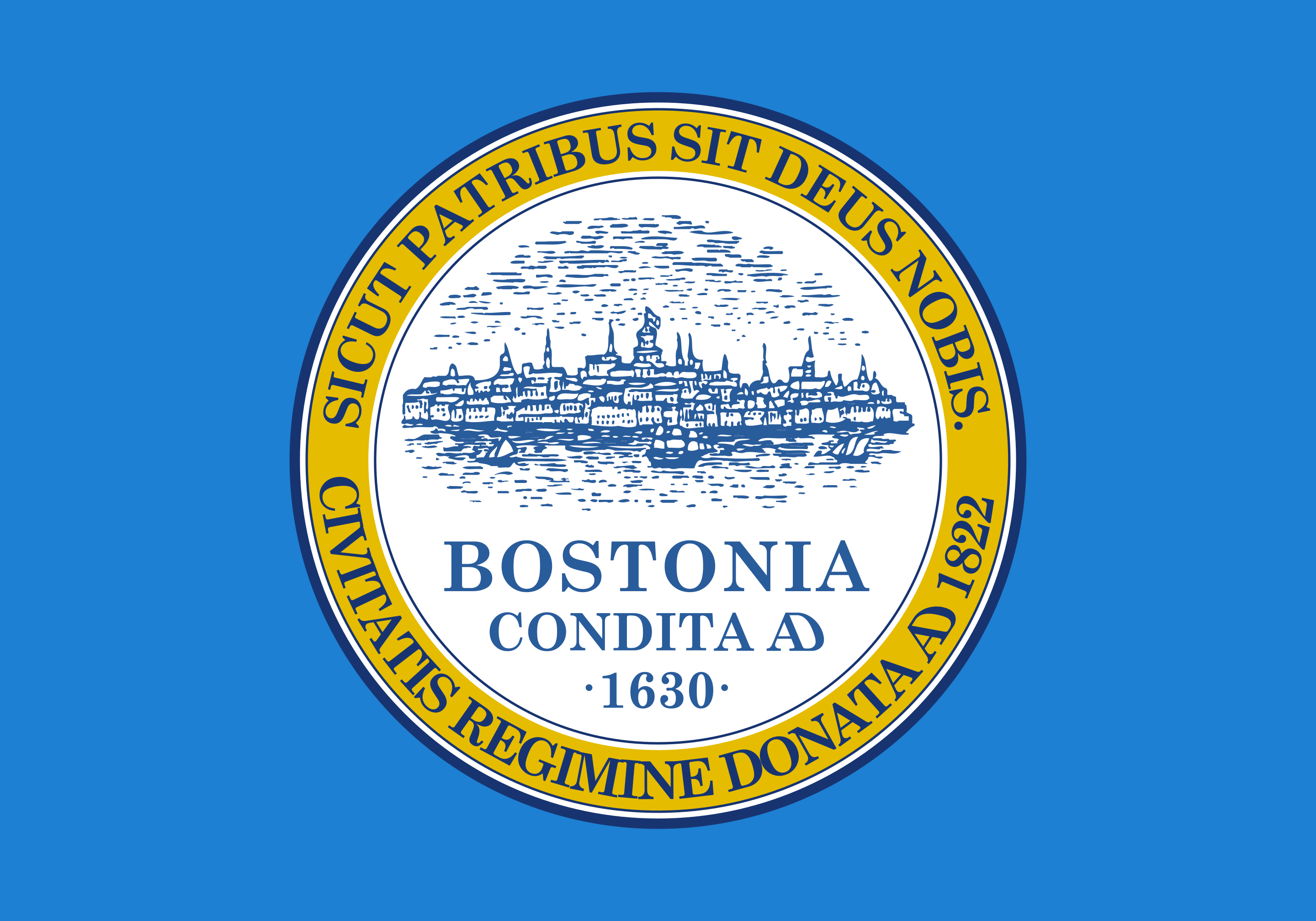
The North American Vexillological Association (NAVA) ranked this 133rd out of 150 city flags. Critics have labeled it an “seal on a bedsheet”. This flag isn’t inspiring. Most Bostonians don’t even know we have a flag and regularly fallback to our sports programs for symbols of pride.
Problems
The flag breaks all design guidelines.
NAVA has five principles of good flag design:
Keep It Simple. The flag should be so simple that a child can draw it from memory.
Use Meaningful Symbolism. The flag’s images, colors, or patterns should relate to what it symbolizes.
Use 2 or 3 Basic Colors. Limit the number of colors on the flag. Colors should contrast well and come from the standard color set.
No Lettering or Seals. Never use writing of any kind or an organization's seal.
Be Distinctive or Be Related. Avoid duplicating other flags, but use similarities to show connections.
Our flag currently breaks all of these principles. It has a complicated seal, the skyline of Boston is too intricate for anyone to be able to draw it from memory, the flag is just like most other municipal flags and isn’t distinctive in the slightest.
Symbolism Issues
The symbolism for the flag was originally supposed to match the yellow and dark blue colors of our revolutionary war uniforms. This is a powerful symbol for the history of the city and the country. However, all flags flown are now a much lighter blue than originally specified. At some point either the manufacturer or someone else changed the dark blue to be a lighter blue. I admired the revolutionary symbolism, but it became lost here.
Recognition Issues
Most Bostonians have no idea we have a flag, let alone what it looks like. We deserve a symbol that can be well marketed. We cede recognition of the city to our sports. Not all Bostonians are interested in sports and they should have a symbol to show their pride in the city.
Representation Issues
The city seal is the focal point of the flag and is a representation of the government. We should avoid this. Our city flag should represent the people, the land, the history, and the future of Boston, not the government.
Marketability and Inspiration Issues
Residents don’t recognize the flag, let alone get inspired by it. The seal makes manufacturing, design, and adaptation difficult. A city flag can be a platform from which new adaptations and creative applications can spring to life. Creators and artists should be able to draw inspiration from this symbol. Chicago and DC flags are stunning and and great examples to look toward.
Good design can inspire and lead to more civic pride in a good positive feedback loop. Our sports teams own most our cities branding. Some folks don’t have an appreciation for sports and we should give them a symbol not tied to those programs.
Objective
The new Boston flag should answer all of these problems. It should follow good design principles, have rich symbolism, be recognizable, representative of the city, and inspiring.
Process
I’m going to run through the evolution of the design. I’ll add photos, details on my thought process, and go over what I learned. I’ll mostly be showing you the happy path and the variations I got the most insight out of. I used Figma as my tool of choice.
Inspiration
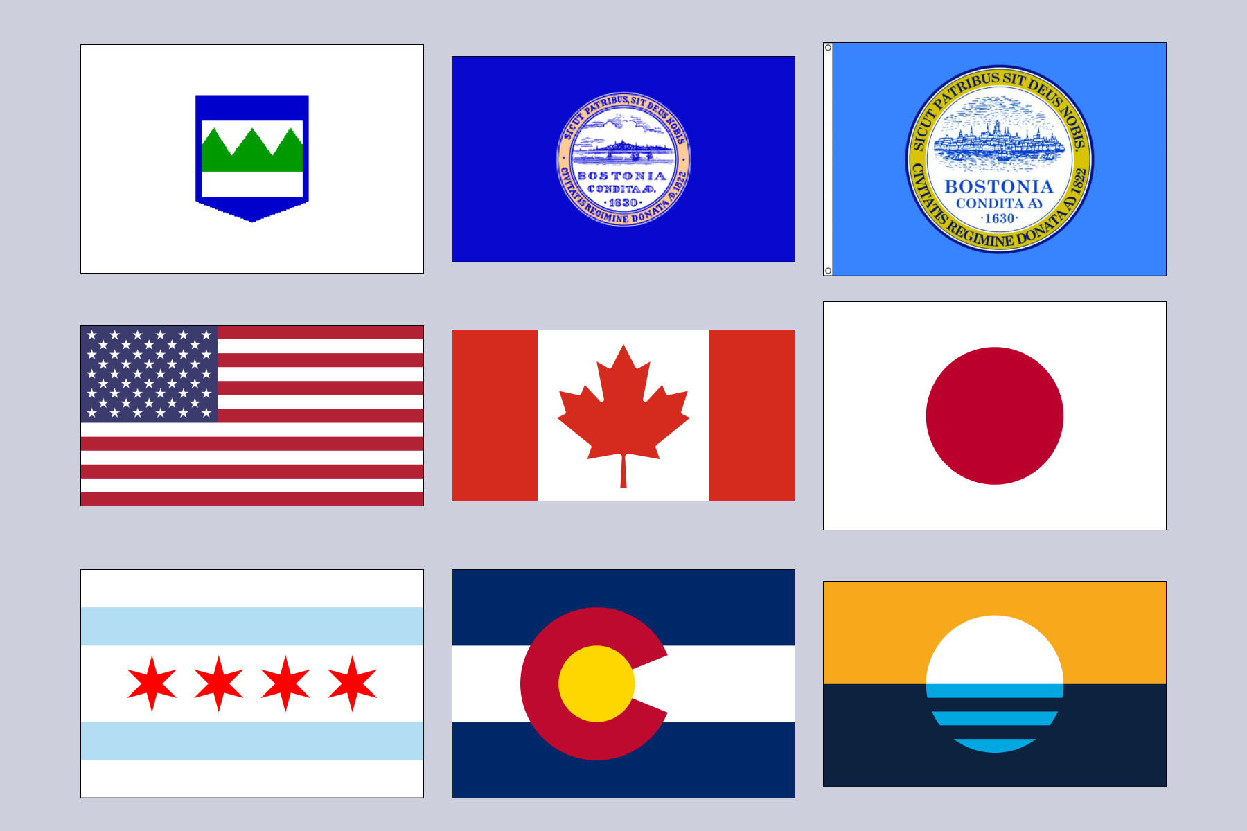
The first row of flags are different versions of the Boston Flag throughout history. The first flag represents the three hills, the Trimountain, of Boston. The rest are a collection of national and city flags I consider beautiful.
First Iteration
In the first iteration I leaded into a couple of core ideas:
I focused on keeping the colors similar to the current flag. The revolutionary war was source of symbolism I appreciated.
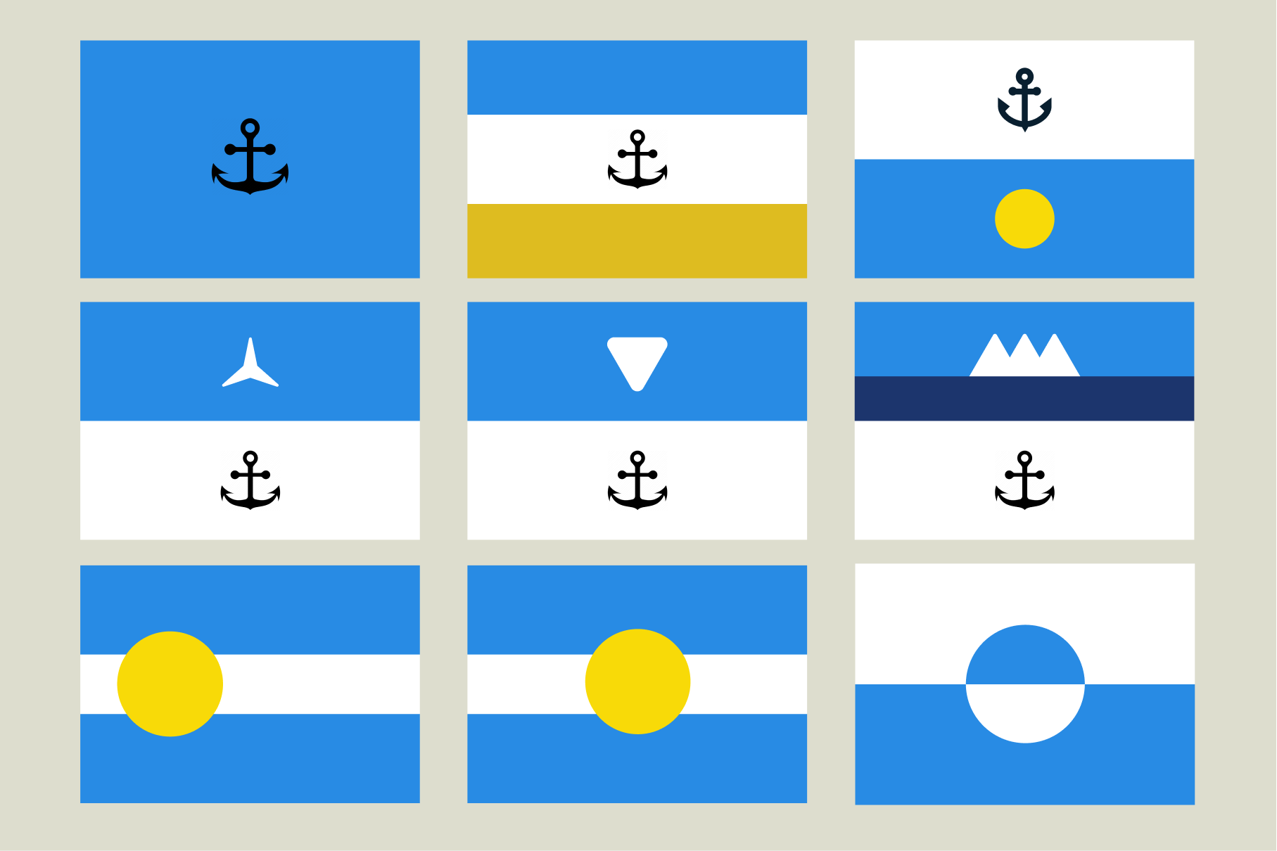
I tested an anchor as a representation of the harbor, a major source of early population growth and economic activity for the city.
I leaned into the original idea of Boston’s “three hills”. I used a variety of triangles and three pointed stars to represent this.
I had a lot of variation in testing at this stage but nothing was particularly inspiring, unique, or fit as a good symbol for Boston. I liked the idea of the revolutionary war uniform as a symbol for the flag. The Boson Massacre, the Boston Tea Party, and many other similar events catalyzed US independence. I tried to lean into this more in next iteration.
These flags were simple and recognizable, but they shared too many similarities with other flags like the UK and the Confederacy. I quickly moved on from these.
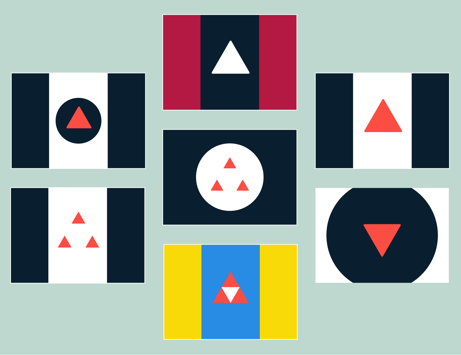
I was more comfortable with this second iteration. I used more red and orange and leaned into into the idea of the three hills. The three-triangle variations were fun but looked too much like the Legend of Zelda’s triforce. The symbolism here also wasn’t resonating deeply. The three hills were important once, but not core to the identity of Boston. I looked for more inspiration.
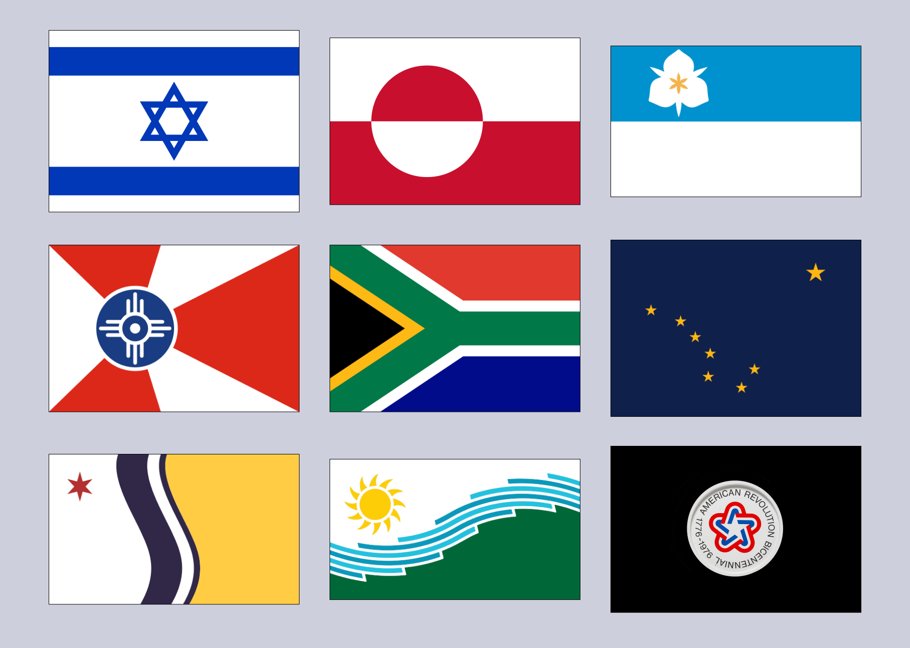
Once again I looked for beautiful examples that I had respect for. Out of this batch there were a couple of themes I latched onto.
Geographical symbolism is powerful: River stripes are often prominent and the Charles River in Boston is an integral part of the city’s landscape.
Centerpieces can be beautiful and inspiring: I especially found the design of the US Bicentennial to be a lovely design.
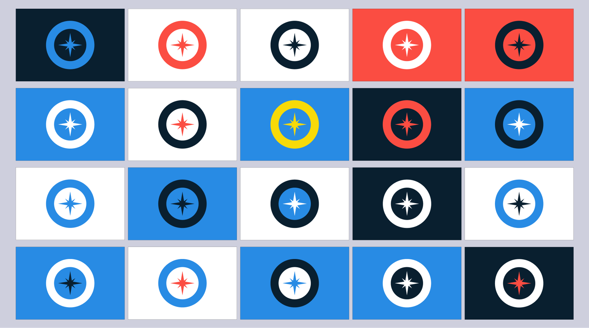
Centerpiece symbols are powerful: The symbolism of the three hills wasn’t resonating. I loved the symbolism of the harbor, when I tested an anchor early in the process. However, I didn’t care for the anchor itself. Maybe a compass would resonate more?
Afterward, I pivoted and mostly focused on a design for a centerpiece. A couple of options came from this.

The compass was a turning point. It resonated with me more as a symbol for the harbor and Boston’s innovation. It’s simple, beautiful, and encapsulates the city’s economic strength. To top it off, I found the Boston branding guidelines. This established a familiar color palette that would naturally feel more like Boston.
The first draft I was proud of:
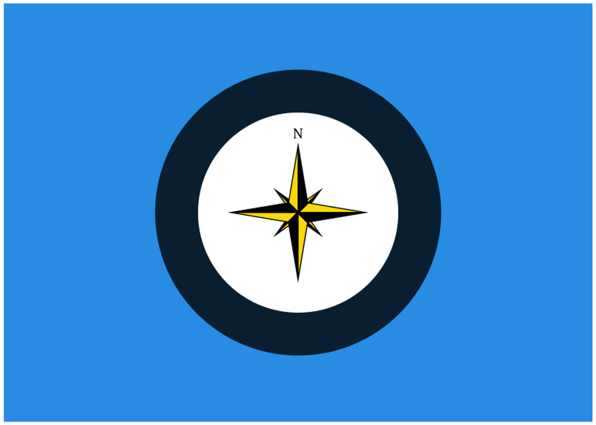
This first draft was the core inspiration for all variations after this. The compass was a symbol for the harbor and Boston innovation, the dark blue circle was a representation of the Charles River, and the outer light blue would represent the Atlantic Ocean. Many variations were created from this, but the final version would be similar.
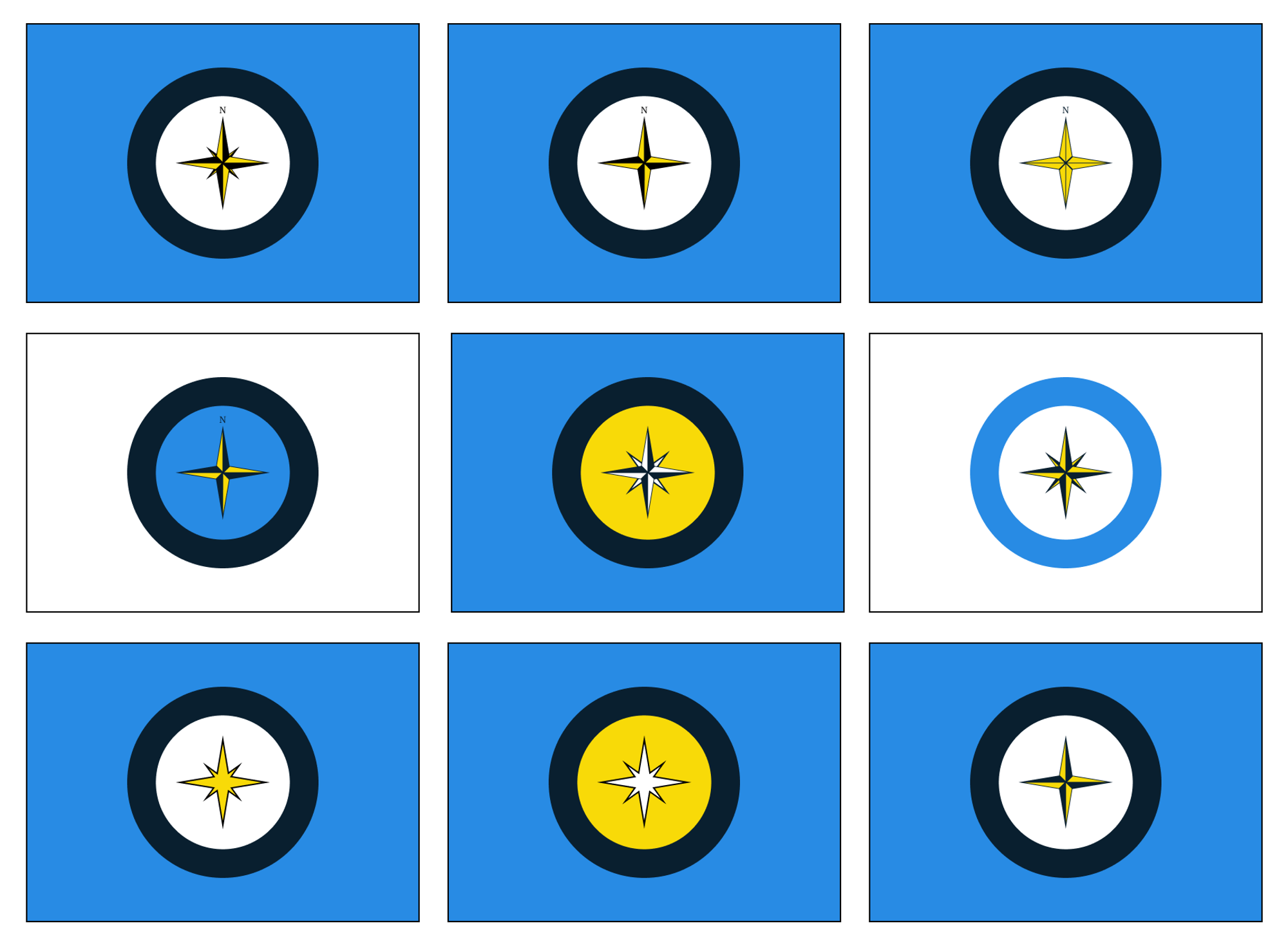
New variations changed mostly the compass styling and the core colors. I loved the compass, but the yellow didn’t quite feel like Boston. The blue and yellow are the Boston Marathon colors, the Bruins colors, a new Red Sox uniform, and the colors of our revolutionary war uniforms (not really). It wasn’t hitting home.
It needed a different color. A color that felt more like Boston.
It needed red.
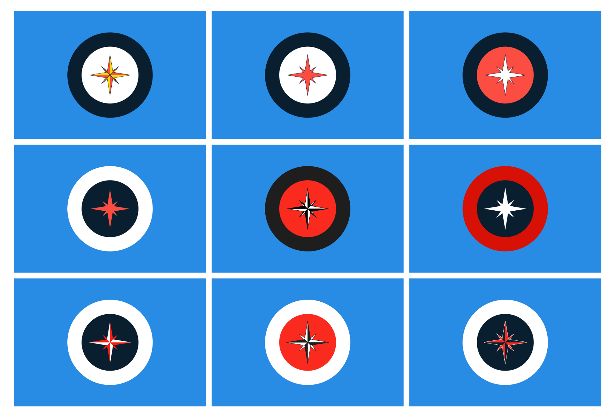
Red symbolizes the historic freedom trail and Boston's distinctive red brick architecture. These felt like Boston and were resonating well!
Some of these were extra fun, but suffered some flaws. The middle right felt too much like Captain America. The bottom right, with the white outline, looks incredible up close, but it doesn’t translate well at a distance.
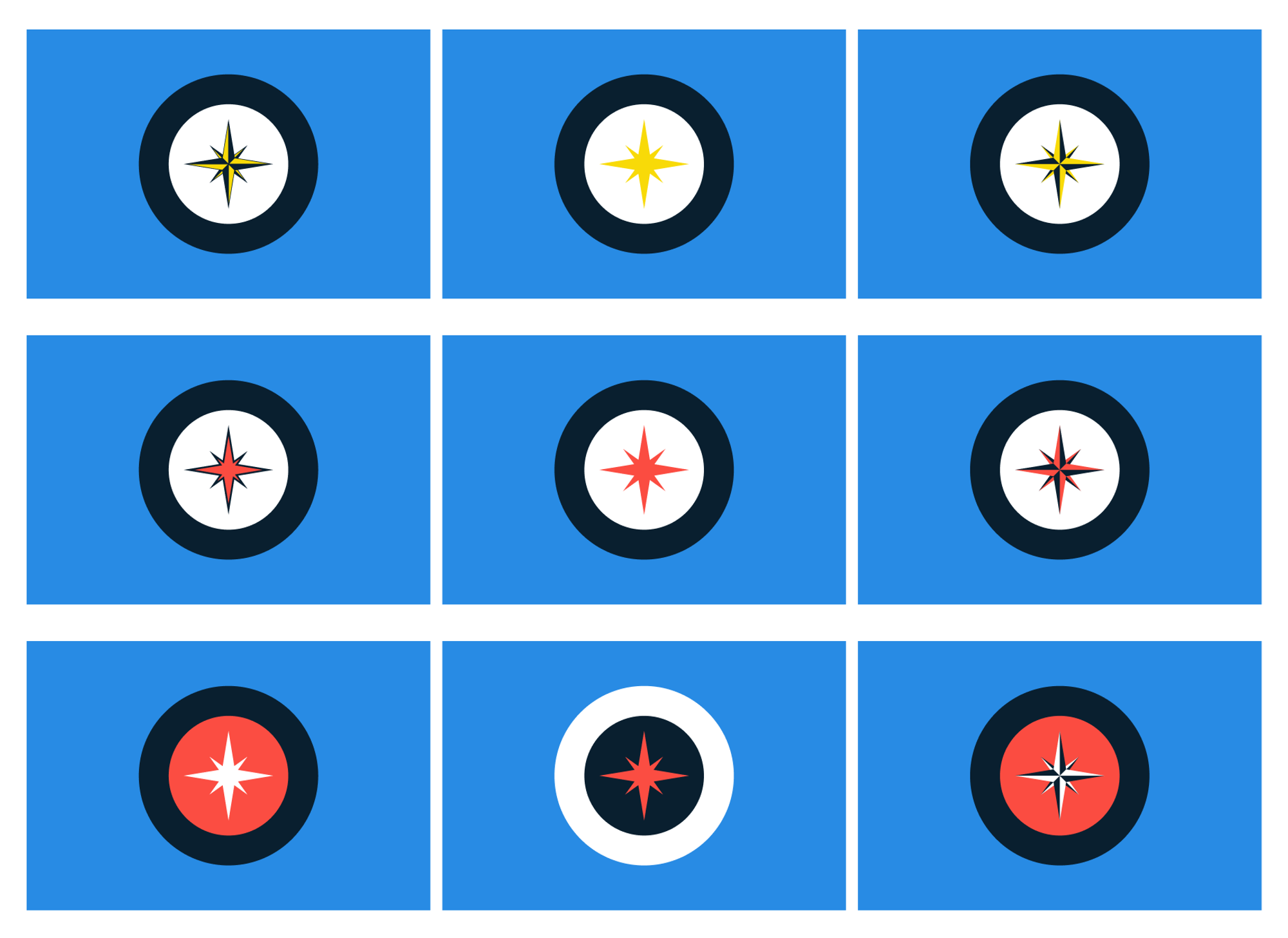
I made more precise measurements at this stage and settled on some finalists. These finalists were experimented on a lot and felt the best. After ranking symbolism, color contrast, manufacturing impact, and overall feeling, the middle flag came out the winner.

You can read full details on symbolism and dimensions on this page.
New flags usually go through a local design competition before getting adopted. A symbol created by the people for the people. This wasn’t created for a competition but this will be my submission when the city is ready to have one.
Roman Mars captures the original inspiration for this project well.
A great city flag represents a city to its people and its people to the world at large. When a flag is beautiful, that connection becomes beautiful.